Showing posts with label amanda thompson. Show all posts

Wednesday, December 12, 2012

Landscapes: An end of semester special!

(I'm going to stop counting the posts, if you need to look for a specific post, use the search option at the top.)

WOW it has been a while, I apologize for that. Onwards and upwards!

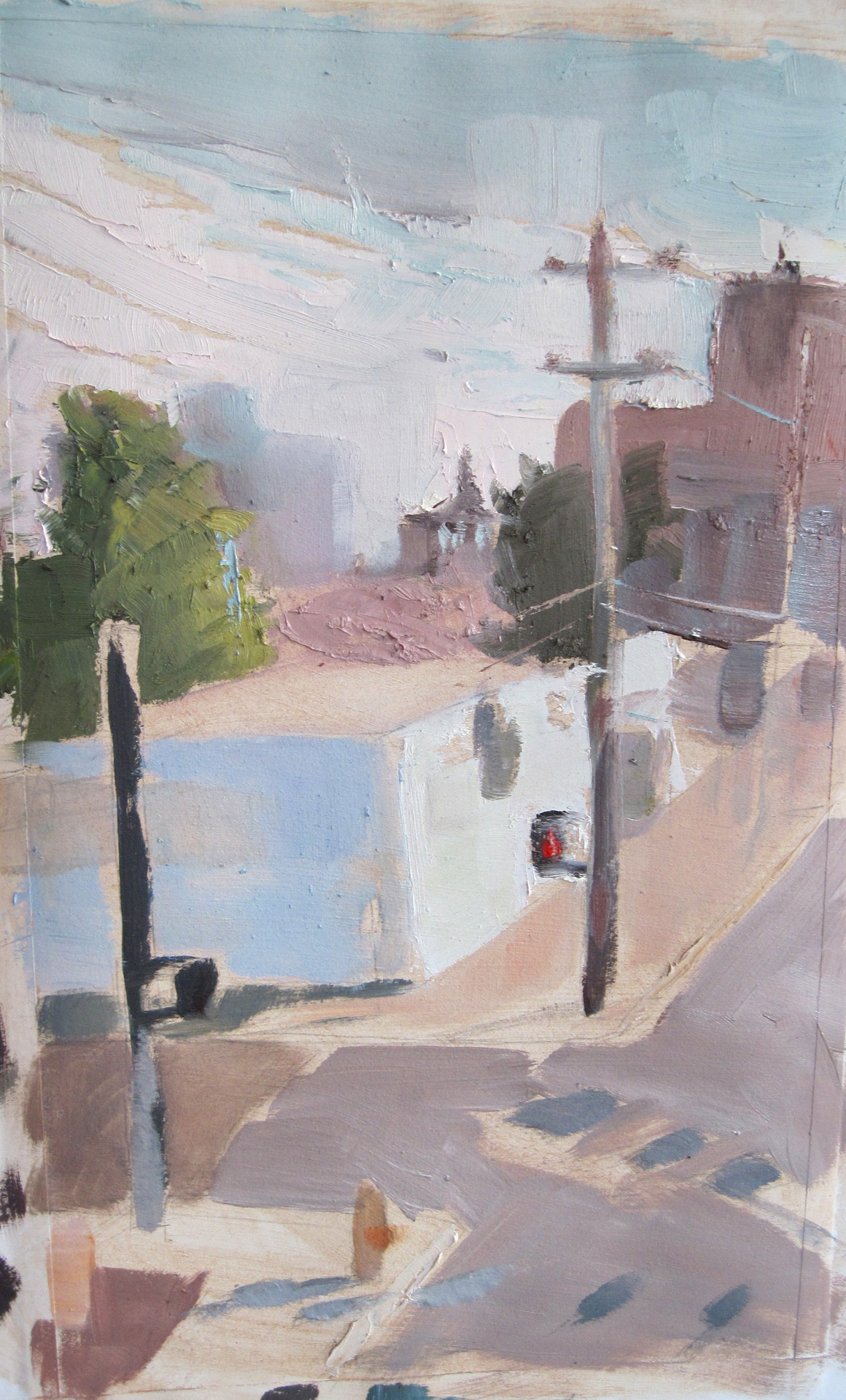
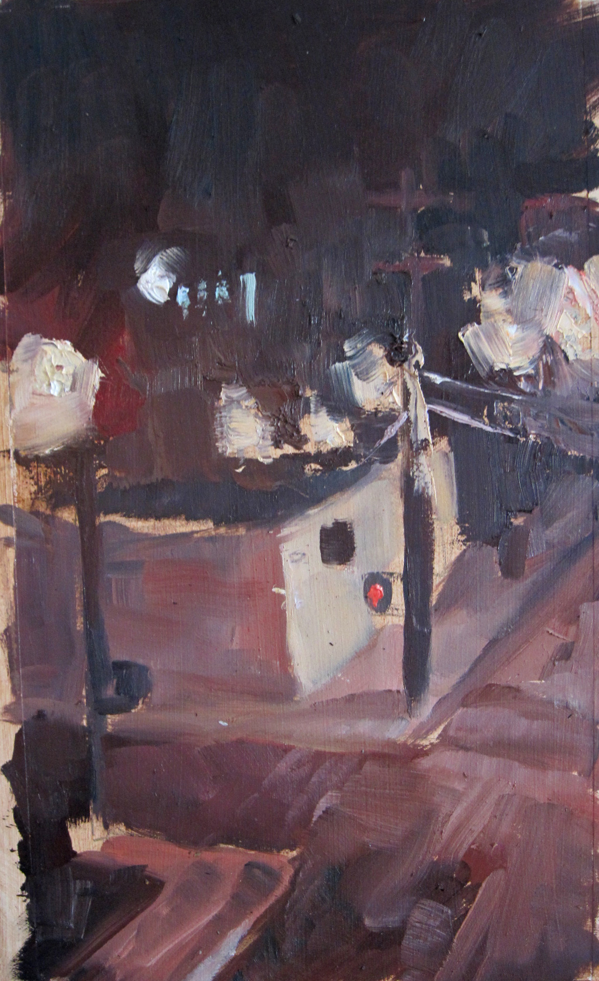
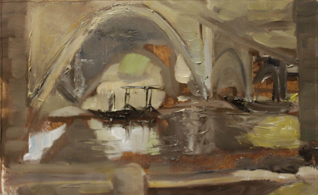
I have learned a lot from Landscape painting this semester.  The sheer know-how I learned just from painting a lot of one session paintings is astounding.  I was forced to find things I liked about a landscape, focus on them, and figure out how to make them clear within the time limit I had and the one layer I had to work with.
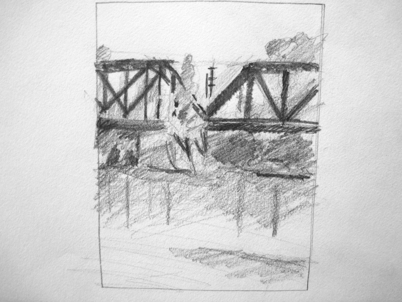
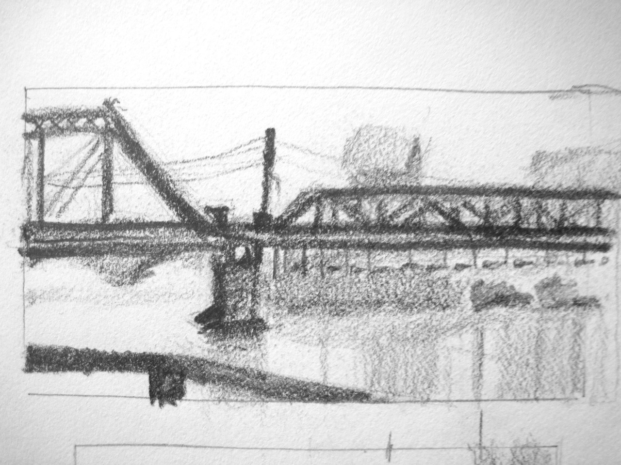
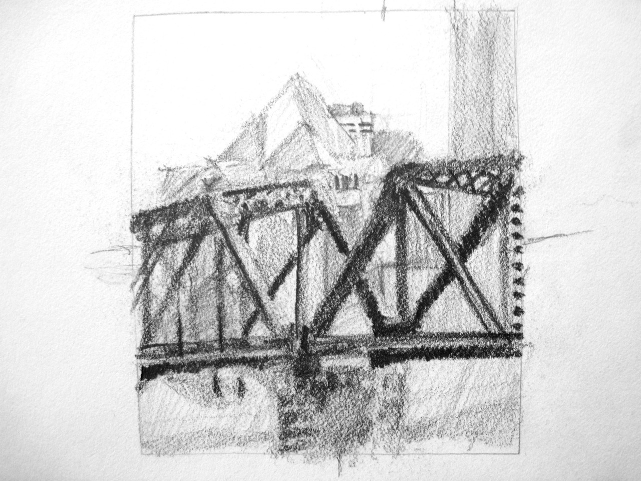


We were only allowed to use palette knives and black and white paint. It was a really interesting challenge!
Day

Night


Really starting to get a hang of this palette knife "technique".

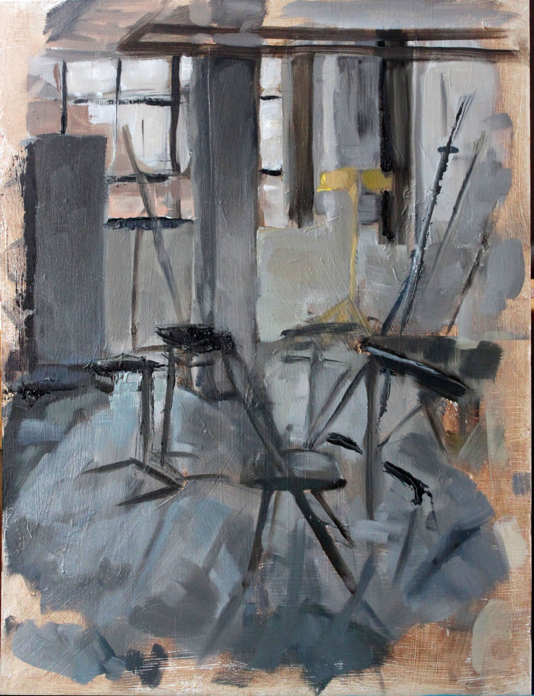
That's it for the Plein Air paitnings.  Then we focused on in class studio paintings.  

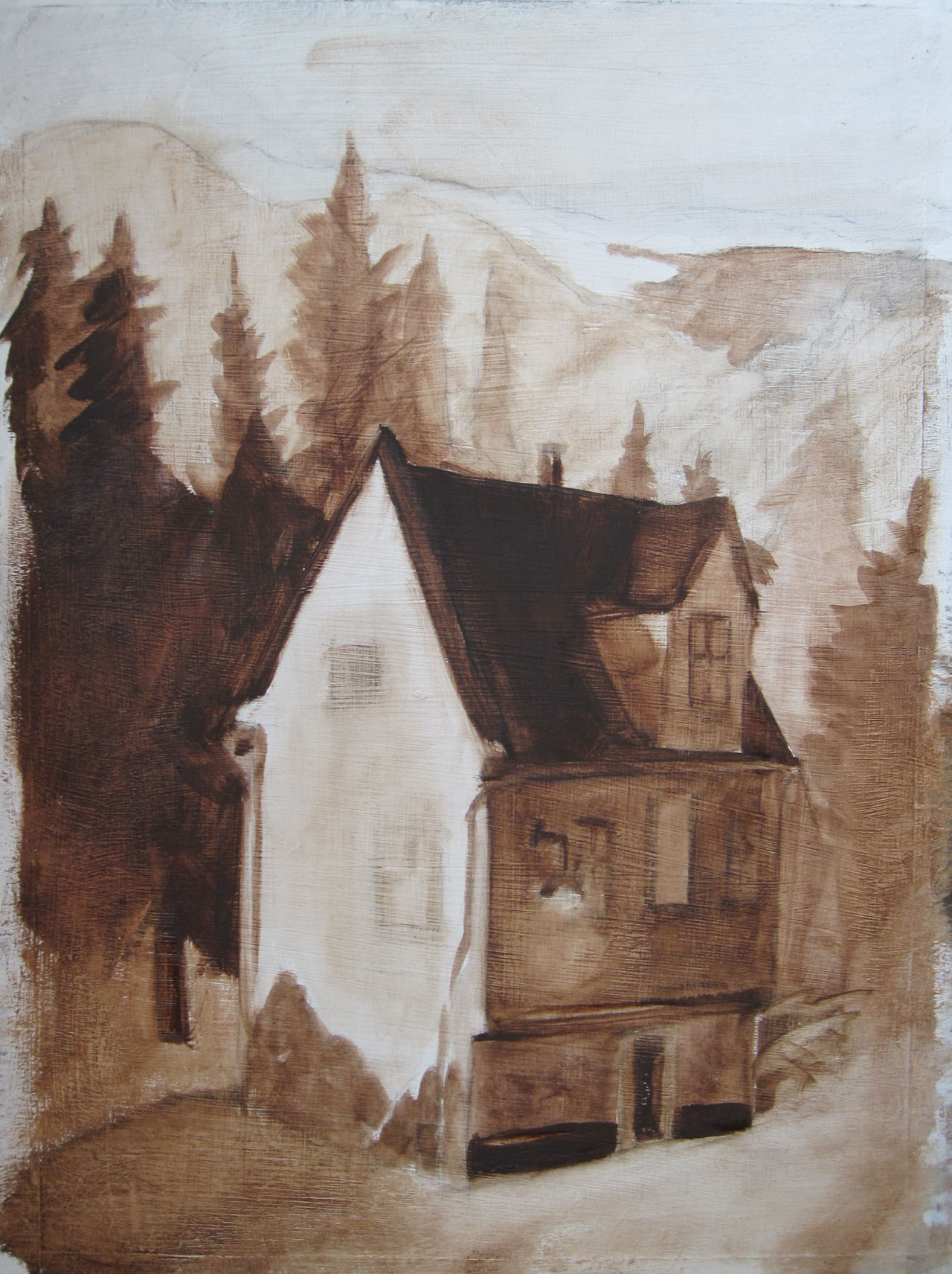
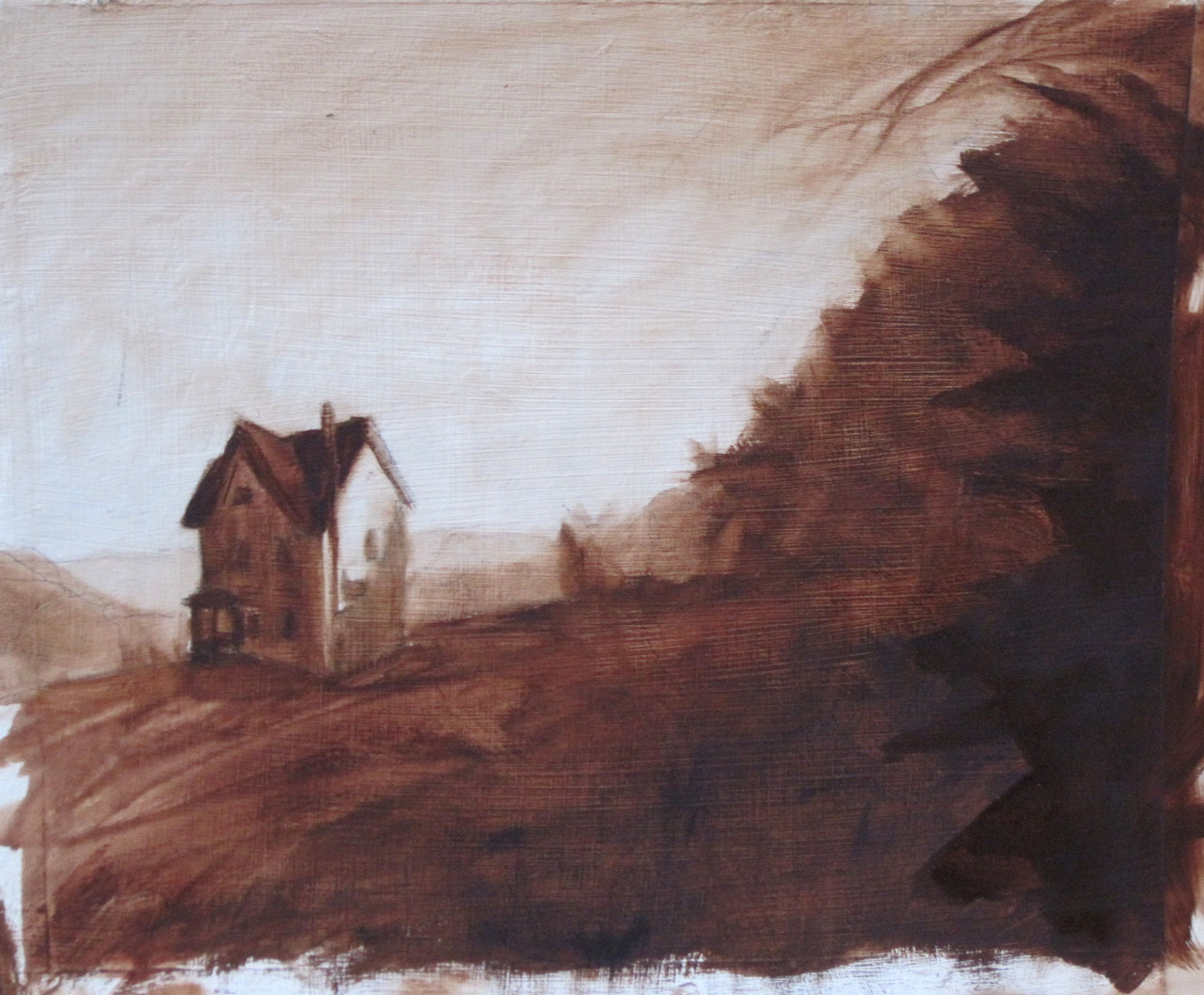
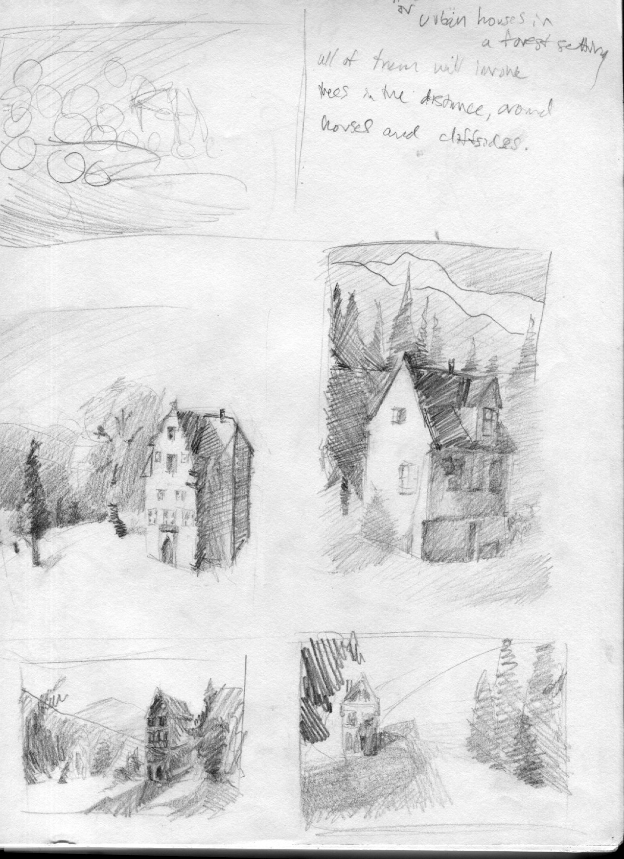
The theme for mine is isolation.  I chose to use little urban houses and place them in the middle of the seemingly endless woods.

Underpainting. Cute lil house. A lot of these were found in Altoona PA for Illuxcon last month. 

Color version. It's still a WIP as of now.
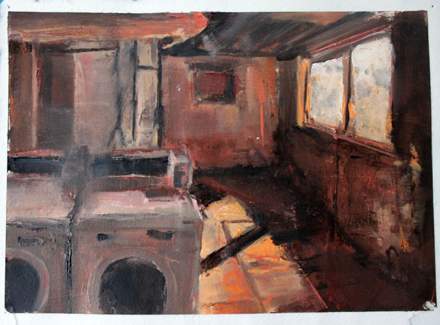
I decided this one didn't need to be colored, it described isolation and loneliness with just reds and browns.

My teacher brought this artist to my attention: Albert Thayer. 

WE CAME ACROSS THIS. Look familiar? If you could see the painting above in real life (crappy digtial photos...) you may be freaked out by the very similar color schemes and material.  I like this guy... check out his work!


All in all, great no-stress class. Totally recommend it! Gong to try a few landscapes over winter break if I can :D

Going to post a good deal over the next couple weeks- heads up! Thanks for reading, check out my website and tell me what you think :]


Sunday, October 28, 2012

#103 Alien and Prometheus

Sorry its been a while, blogger!  I'll catch you up one chunk of work at a time.

This project involved redesigning a cover for an article, a two page spread, and two spot illustrations.    I decidecided to to "Prometheus: Between a rock and a hard place.  How Ridley Scott's Prometheus deals with impossible expectations and mythological baggage."  It was an article looking at the movie's flaws and also looking at it from several different points of view.


I tried using an experiment to color the two page spread and the two spots.  

It involves ink linework
and a painting process. 
It's certainly been interesting... may continue to use this in the future!

Thursday, September 13, 2012

#100: SCHOOL IN ALL ITS GLORY

So it's been a while sinse the last update... you could say I've been busy!  Art school is definitely just as challenging as I remember, but also just as fun.  Let's get started on some awesome portfolio pieces this year, shall we? 

Again, if you would like to see even more of my art, check out my art Tumblr!  

First of all, I'll catch you up on school work.

Here's a magazine cover I am working on for FilmComment magazine featuring the article “Prometheus: Between a rock and a hard place”.  It focuses on the impossible standards of the original alien movie they tried to live up to while still being ambiguous about the origin of aliens and ourselves.


Alternative idea...


For a Black and White Illustration class I'm designing a poster for the Sundance Film Festival.  I'm choosing between these first two.


 I'm starting a landscape class this year!
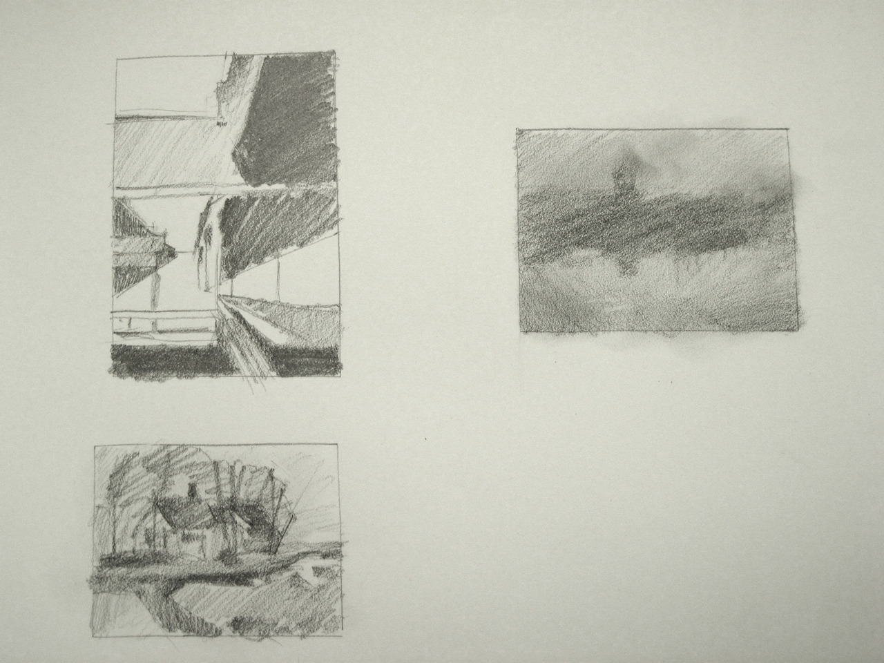
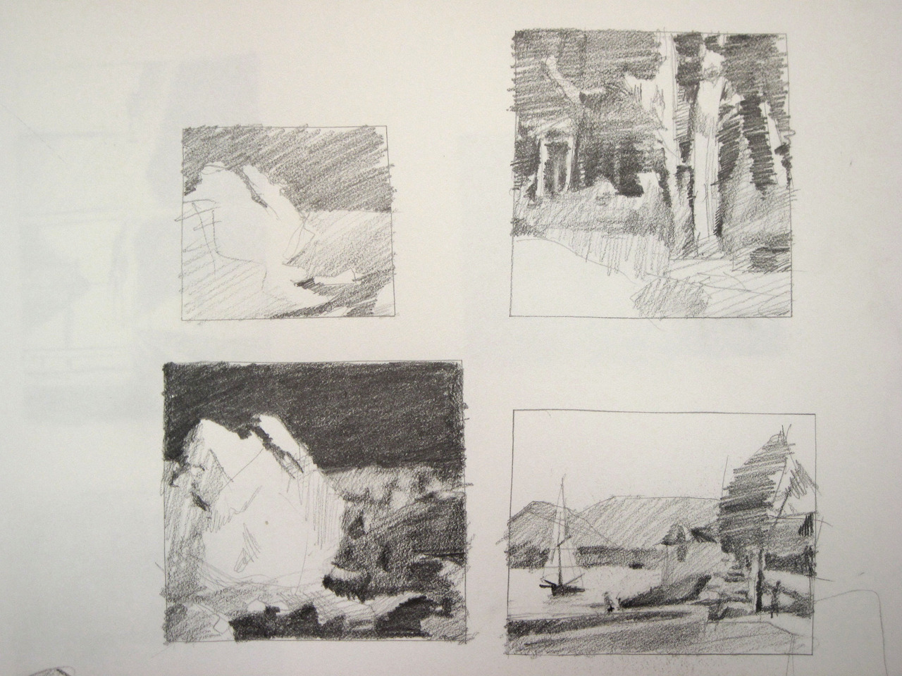
Some studies

Sketches for a oil palette knife painting.  I really like palette knives.
Here's a "moodboard" I made showing my artistsic influences.


Monday, March 12, 2012

Finished 50's diner poster

quick fun sketch
I can see some major problems , but I'm glad I did this.  I need to continue to force myself to use type and commercial design.